Among the many parameters that we are measuring on a continuous basis in our restored marsh, we have measured the Colored or Chromophoric Dissolved Organic Matter (CDOM) using a Turner design sensor. Below, you can view the dynamics of CDOM as a function of flow and stage. The CDOM concentration values are only relative as calibration against Quinine Sulfate Equivalence has not been applied on this data. There are many things to say about these data. For today, I just let you enjoy the view and think about it!
Wednesday, May 23, 2012
Dissolved Organic Matter fluorescence dynamics in our restored coastal marsh
by François Birgand
Among the many parameters that we are measuring on a continuous basis in our restored marsh, we have measured the Colored or Chromophoric Dissolved Organic Matter (CDOM) using a Turner design sensor. Below, you can view the dynamics of CDOM as a function of flow and stage. The CDOM concentration values are only relative as calibration against Quinine Sulfate Equivalence has not been applied on this data. There are many things to say about these data. For today, I just let you enjoy the view and think about it!
Among the many parameters that we are measuring on a continuous basis in our restored marsh, we have measured the Colored or Chromophoric Dissolved Organic Matter (CDOM) using a Turner design sensor. Below, you can view the dynamics of CDOM as a function of flow and stage. The CDOM concentration values are only relative as calibration against Quinine Sulfate Equivalence has not been applied on this data. There are many things to say about these data. For today, I just let you enjoy the view and think about it!
Friday, April 20, 2012
Illustrating flow proportional sampling
by François Birgand
One of our domains of expertise is the computation of uncertainties on nutrient loads at the outlet of watersheds. We have published several articles on the subject and will be presenting some more results at the ASABE conference in Dallas, TX at the end of July. One of them will be the evaluation of the flow proportional sampling method to calculate nutrient loads.
This methods consists in automatically sampling and compositing the samples into one big bottle (usually around 20 L). The nutrient or material load can be calculated by multiplying the composite concentration by the flow volume corresponding to the period during which the samples were taken. This system can be set up to measure the nutrient load for just one storm, or set up to measure loads on a longer term basis, including annual periods. In the latter case, the system is set so that samples are composited over a period corresponding to two consecutive field servicing times. The system requires an automatic sampler connected to a flow calculating device. This device computes flow rates and calculates the flow volume accumulated since the last sample. When the cumulative volume reaches a defined threshold, the device triggers the sampling, usually of a small volume.
The first point we want to illustrate, is the concept of cumulative flow. Cumulative flow over a given period is the integral under the hydrograph over the same period. This is illustrated in the video above. Instantaneous flow rates (hydrograph) are represented in the thin blue line while the cumulative flow volume (in mm) is represented both by the area under the hydrograph and the thick blue line. The triggering of a sample can thus take place after e.g. 0.5 mm has flowed by.
Lots of hydrologists use the flow proportional composite method, and we believe for the right reasons. We have noticed that to explain how it works, it often involves hand waving and other less than ideal artifices. For that reason, we have decided to create an illustration in the form of a video, which we hope will provide some help. Ideally, this video will be used by others in the future.
The video shows the same hydrograph as before and a red dot travels through time. The vertical bars mark the times at which the sampler is triggered and the water accumulated is illustrated in the bottle. Notice, and that is the heart of the method here, that the sampler is triggered a lot more often during high flows. One can show that the concentration in the composite bottle is a very good approximation of the flow weighted concentration over the same period of time, which warrants the use of this method to calculate nutrient and material loads. There are cases, and in particular for suspended solids where this method may induce some significant error, although much smaller than for any other methods. This will be discussed at length this summer.
One of our domains of expertise is the computation of uncertainties on nutrient loads at the outlet of watersheds. We have published several articles on the subject and will be presenting some more results at the ASABE conference in Dallas, TX at the end of July. One of them will be the evaluation of the flow proportional sampling method to calculate nutrient loads.
This methods consists in automatically sampling and compositing the samples into one big bottle (usually around 20 L). The nutrient or material load can be calculated by multiplying the composite concentration by the flow volume corresponding to the period during which the samples were taken. This system can be set up to measure the nutrient load for just one storm, or set up to measure loads on a longer term basis, including annual periods. In the latter case, the system is set so that samples are composited over a period corresponding to two consecutive field servicing times. The system requires an automatic sampler connected to a flow calculating device. This device computes flow rates and calculates the flow volume accumulated since the last sample. When the cumulative volume reaches a defined threshold, the device triggers the sampling, usually of a small volume.
The first point we want to illustrate, is the concept of cumulative flow. Cumulative flow over a given period is the integral under the hydrograph over the same period. This is illustrated in the video above. Instantaneous flow rates (hydrograph) are represented in the thin blue line while the cumulative flow volume (in mm) is represented both by the area under the hydrograph and the thick blue line. The triggering of a sample can thus take place after e.g. 0.5 mm has flowed by.
The video shows the same hydrograph as before and a red dot travels through time. The vertical bars mark the times at which the sampler is triggered and the water accumulated is illustrated in the bottle. Notice, and that is the heart of the method here, that the sampler is triggered a lot more often during high flows. One can show that the concentration in the composite bottle is a very good approximation of the flow weighted concentration over the same period of time, which warrants the use of this method to calculate nutrient and material loads. There are cases, and in particular for suspended solids where this method may induce some significant error, although much smaller than for any other methods. This will be discussed at length this summer.
Wednesday, April 18, 2012
Displaying our innovations
by François Birgand
The College of Agricultural and Life Sciences (CALS) at NC State was hosting a conference: "Stewards of the future: Research for Human Health and Global Sustainability". Along with the conference, CALS hosted its Innovation Fair, where our team had two booths. We are firm believers that new discoveries will come with news ways of obtaining data, and in particular will come from high time resolution data. We decided to show our latest innovation in this field.

Randall Etheridge (Ph.D. student) and Brad Smith (Research Assistant - left and middle on the picture above) manned the booth entitled 'Capturing the perpetually changing world of a tidal marsh'. A live demonstration of our multiplexer pumping system to measure water quality on a high frequency basis for up to 12 sources was displayed along with a poster and a slide show presenting preliminary results from our study coastal marsh near Beaufort, NC.
I manned the GaugeCam innovation booth entitled 'Hydrology for all: measuring water level using webcams'. This booth had posters, videos, a slide show of how the system works and of results, live data streaming from the field and a display of the GaugeCam hardware.


Overall, we got some good feed back from the few people that did stop by. I really think our presentations were very interactive and were among the better ones for that. We did not capture enough interest though but we learned a lot from that nonetheless. One day, all this will pay off!
Tuesday, April 10, 2012
Flow, velocity and tidal harmonics in a restored coastal marsh
By François Birgand and Randall Etheridge
The goal of this post is to provide some fascinating flow patterns we have observed in a restored marsh where we evaluate the ability to dissipate excess nutrients coming from adjacent agricultural lands. You may find our latest results here presented at the NC WRRI conference in March 2012. You may also visit the site dedicated to the marsh results.
In the video below, you will see the flow and velocity patterns observed in November 2011 at the upstream station. The tidal fluctuations are represented in the middle by rising and falling rectangles. Flow is represented on the left. Positive flow represents ebbing tide (water penetrates in the marsh coming from upstream agricultural land) and negative flow, flowing tide. You may observe that there are no two same tides and tidal cycles. Water quality parameters and concentrations also vary dramatically. Another blog will be published on that subject.
It is particularly interesting to see a very peculiar pattern at high tide where flow can suddenly be inverted, which induce 8 shape curves. This is due to the existence of a flow loop in the marsh.
At the downstream station, the tidal harmonics exhibit a more expected behavior. Watch for the differences in the flow and velocity scales.
This needs to be accompanied by the water quality analyses, but we thought we should post this now for your enjoyment!
Thursday, October 20, 2011
Hot spots and hot moments near streams
By François Birgand, Assistant Professor
The concept of hot spots and hot moments have gained popularity in the hydrology world and the near stream zone has been recognized for a long time as one of these hot spots. My mentor, adviser and now colleague Dr. Wayne Skaggs and I were talking about hysteresis in the water table versus drainage rate curves right after a rainfall events. Actually, most drainage models do not know how to handle this effect very well and that may be problematic. You will see in the video below that for a short period of time following a rainfall event (@ 110 hours in the simulation), drainage rates actually are, for the same water table height at mid field, a lot higher right after rainfall than they were prior to rainfall.
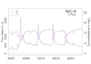
So what are the implications of this for water quality? Many things! To keep it short in this post, one thing is that the very high drainage rates imply intense leaching of the near stream (or in this simulation near ditch) zone. This likely explains to a significant part the 'dilution effect' of nitrate concentrations recorded in Brittany, France (see figure below). This dilution effect has historically been attributed to dilution by surface runoff. This may be true in many hillslope watersheds, but the hysteresis effect shown in the video can, by itself, explain this observation too! The reality is probably a combination of both in most watersheds.
The concept of hot spots and hot moments have gained popularity in the hydrology world and the near stream zone has been recognized for a long time as one of these hot spots. My mentor, adviser and now colleague Dr. Wayne Skaggs and I were talking about hysteresis in the water table versus drainage rate curves right after a rainfall events. Actually, most drainage models do not know how to handle this effect very well and that may be problematic. You will see in the video below that for a short period of time following a rainfall event (@ 110 hours in the simulation), drainage rates actually are, for the same water table height at mid field, a lot higher right after rainfall than they were prior to rainfall.
So what are the implications of this for water quality? Many things! To keep it short in this post, one thing is that the very high drainage rates imply intense leaching of the near stream (or in this simulation near ditch) zone. This likely explains to a significant part the 'dilution effect' of nitrate concentrations recorded in Brittany, France (see figure below). This dilution effect has historically been attributed to dilution by surface runoff. This may be true in many hillslope watersheds, but the hysteresis effect shown in the video can, by itself, explain this observation too! The reality is probably a combination of both in most watersheds.
Friday, September 30, 2011
Flow and load duration curves
By Beth Allen, Ph.D. student
Lately, we have been researching and developing techniques of analyzing continuous water quality and hydrology data in order to explain hydrological and biogeochemical processes controlling stream chemistry in watersheds. One of the techniques in which we have applied to an entire year of water quality and hydrology data is a method that assesses how relatively reactive nutrient/sediment loading is to flow and the relative flashiness of a watershed. This method, referred to as load and flow duration curves, determines the percentages of the total load (Mk%) and discharge (Vk%) that occur in a percentage of the total sampling time, termed probability of occurrence. Mk% and Vk% duration curves can be plotted as a function of the probability of occurrence, which provides an interesting way of demonstrating how loading relates to flow and varies among water quality constituents. This method can also be applied to individual storm events to assess if there is a first flush response. We processed all data using R code and provide a sample dataset and code such that all of you may give this method a try!


R Code link to produce the last two graphs
Lately, we have been researching and developing techniques of analyzing continuous water quality and hydrology data in order to explain hydrological and biogeochemical processes controlling stream chemistry in watersheds. One of the techniques in which we have applied to an entire year of water quality and hydrology data is a method that assesses how relatively reactive nutrient/sediment loading is to flow and the relative flashiness of a watershed. This method, referred to as load and flow duration curves, determines the percentages of the total load (Mk%) and discharge (Vk%) that occur in a percentage of the total sampling time, termed probability of occurrence. Mk% and Vk% duration curves can be plotted as a function of the probability of occurrence, which provides an interesting way of demonstrating how loading relates to flow and varies among water quality constituents. This method can also be applied to individual storm events to assess if there is a first flush response. We processed all data using R code and provide a sample dataset and code such that all of you may give this method a try!
Calculating and Plotting Flow Duration Curves
First, instantaneous flow rates in the dataset are ranked in
descending order.
The cumulative discharge is then calculated by integrating
the area under the Q Sorted curve at each data point.
The cumulative discharge calculated at each instantaneous
flow rate can be calculated as a percentage of the total discharge yielding Vk%
values corresponding to the kth cumulative probability and the time elapsed at each point can be calculated as a percentage of
the total time. This works because even
though flow rates are rearranged, the same amount of data points exist within the
dataset with the same time increment occurring between each value. Vk% values
can then be plotted as a function of the percentage of the total time. This is what is referred to as Flow Duration Curves. This provides a way of demonstrating of how relatively flashy the watershed may be either relatively to other watersheds or to previous years.
The flashiness of a watershed refers to how rapidly flow is
altered as a result of storm events/varying conditions. More frequent spikes in flow in response to
precipitation events, in which flow increases and decreases more greatly and
rapidly, are typically indicative of watersheds with predominant portions of streamflow
being influenced by surface runoff, a quicker responding contributor of water
to streamflow.
This method allows us to see the percentage of the total
discharge that occurs in a fraction of the total time with the lowest
probabilities of occurrence corresponding with the highest flow rates
associated with event flow. Therefore,
if one watershed produces a majority of the total discharge in 50% of the time
versus a watershed that produces a majority of the total discharge in 80% of
the time, that watershed may be considered relatively flashier because a greater portion of
the total discharge occurs in association with higher flow rates. In other words, streamflow would be considered
more reactive to event water because the event hydrograph rises and recedes
more quickly than the other watershed.
This quick rise and recession allows for most flow to occur in a smaller
percentage of the time versus the watershed that has a much wider event hydrograph
spanning across a greater range of instantaneous flow values over a greater
period of time. Visually, this method can provide a relative comparison of the
flashiness of multiple watersheds. In
the example above, the shape of the curve in the first watershed would have a
greater slope towards the lower percentages/probabilities of occurrence and the
curve for the second watershed would be somewhat flatter.
Calculating and Plotting Load Duration Curves
This part is similar to calculating Vk% except instantaneous
flux is calculated (instantaneous flow rate * instantaneous concentration) and
ranked in descending order instead.
|
The cumulative load is then calculated by integrating the
area under the QCsort curve at each data point.
Once again, the cumulative load calculated at each
instantaneous flux value can be calculated as a percentage of the total load
yielding Mk% values and the time elapsed at each point can be calculated as a
percentage of the total time. Mk% and
Vk% values can be plotted as functions of the probability of occurrence and multiple
Mk% curves for various water quality components can be plotted simultaneously
for comparison of loading as a function of probability of occurrence. For example,
50% of the nitrate load may be exported in 25% of the time whereas 50% of the
ammonium load may be exported in only 5% of the time. The interaction of flow and concentrations
could be examined further to explain differences among loading and flashiness
of concentrations with event flow.
With the above plot, we see that large changes in Mk% and
Vk% occur near the lower probabilities of occurrence. This demonstrates how crucial continuous water quality data is to understanding loading in watersheds because a large portion of the load can occur within a very small portion of time. We also see that it becomes slightly
difficult to examine differences in the curves towards both ends of the
x-axis. Therefore, it is helpful to use
the qnorm function in R to zoom in on the very low and high probabilities of
occurrence, or on the tails of the normal distribution curve. Check out the plot below and try the code
yourselves! Thanks for reading!
R Code link to produce the last two graphs
Subscribe to:
Comments (Atom)